Logo Philosophy
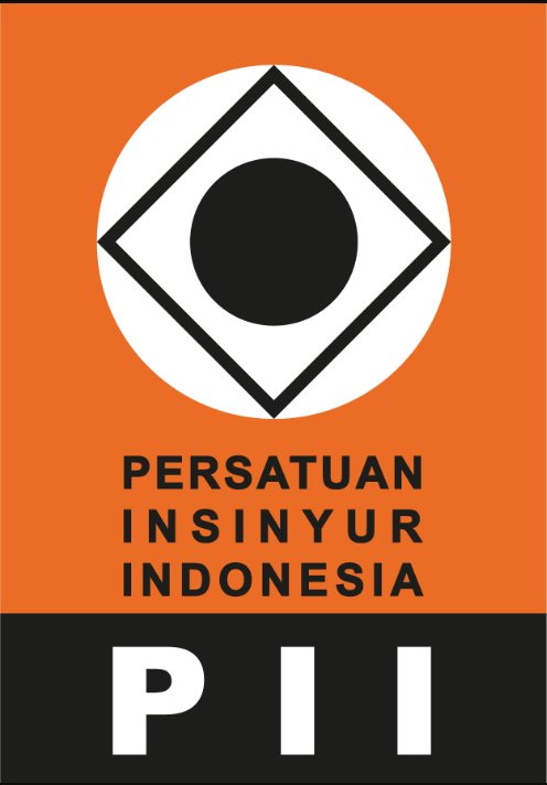
Philosophy of the Logo Institution of Engineers Indonesia (PII) Viewed as a whole, the combination of shapes and colors above achieves a harmonious balance, and is a balanced composition of shapes and colors, which can always be placed on a background of any color without reducing its value and meaning. The broader interpretation is that PII stands firmly on its own feet, is devoted to the advancement of the Indonesian nation through science and technology, is not influenced by any political sect, and makes a real contribution to the welfare of society.
Shape
- Rectangle: is the base form (oreon) of all forms. Every shape can always be returned to the rectangle. So it is not surprising that a school was born in sculpture, fine arts and architecture called cubism, which carries the spirit of all forms returned to their origin, namely the rectangular shape. Furthermore, a rectangle can also be seen as a flat prism. All of these are geometric shapes that every engineer encounters in his or her engineering work.
- Circle: It can be seen as a sphere or cone which is also the second element that often inspires engineering works.
- Circle and Quadrilateral in the Center: It means something that has been carefully considered, as in the word "determination", while "square" means something balanced.
- A Square Surrounded by a Circle: Symbolizes an engineer in his way of working and thinking that is mature, balanced and perfect. By applying knowledge accompanied by accurate calculations and careful consideration, perfect works are created. The black circle in the center is very striking and is the center of attention of every observer, showing the essence of life, which is the source of all life force and symbolizes the transcendent purpose of God Almighty.
Color
Orange - White - Black: Orange, a color obtained from the colors red and yellow, so the effect is lighter than red, but softer than yellow. Orange is located in the semi-bright area, while white is located in the very bright area, so the combination of orange with white in the outer circle produces a contrasting but still soft color.
To provide contrast to the two combinations, black is brought out, so that an overall harmonious color combination is achieved. Judging from the meaning of color, white means holy or nobility. The color combination symbolizes the dynamics of PII with overall mind and full of confidence in work.


